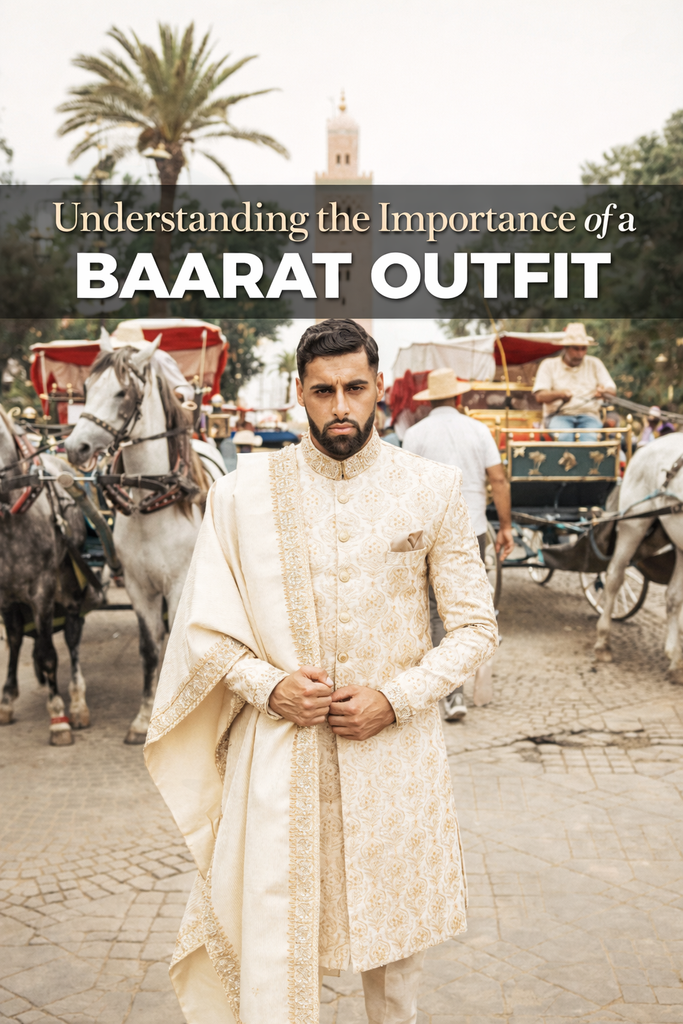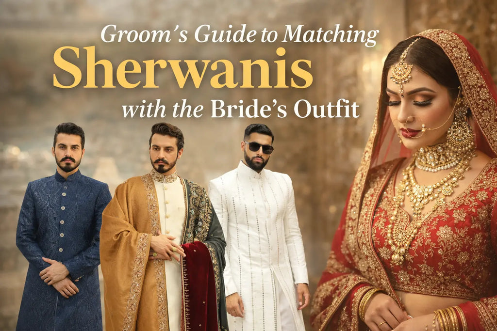
Groom’s Guide to Choosing the Right Color Palette
A Quick Guide to Picking the Groom’s Wedding Colors
Your wedding look starts with color, and the right choice can change everything. Many grooms feel confused when selecting colors for their big day. This Groom color palette guide makes the process simple and stress free. Colors influence your confidence, photos, and overall style. A smart palette helps you stand out without overdoing it.
Choosing groom wedding colors is not only about trends. It is about balance, tradition, and personality. Your outfit should match the wedding mood and setting. The right shades enhance fabric quality and design details. They also make coordination with the bride easier. A well-planned palette always looks timeless.
Understanding the Importance of Color in a Groom’s Wedding Ensemble

Color speaks before words and sets the tone of your entire outfit. Many people judge style within seconds. That is why color selection matters for every groom. This Groom color palette guide helps you avoid common mistakes. The right color boosts elegance and confidence instantly.
Colors also carry emotions and cultural meaning. Deep shades show royalty and strength. Light colors reflect freshness and simplicity. Your wedding dress should reflect your personality. A thoughtful color choice creates harmony. It also improves how fabrics and embroidery appear.
Consider the Wedding Theme When Choosing Colors
The wedding theme plays a major role in color decisions. Ignoring it can make your outfit feel out of place. This Groom color palette guide helps you align style with theme. Every theme has colors that naturally fit. Matching them improves the overall wedding look.
Theme-Based Color Ideas
-
Classic & Traditional: Ivory, gold, maroon
-
Rustic & Outdoor: Beige, brown, olive
-
Beach & Destination: Pastels, ivory, light blue
-
Modern & Contemporary: Navy, black, charcoal
Choosing theme-friendly colors creates visual balance. It also improves wedding photos. Guests notice coordinated looks instantly. The groom looks intentional and polished. This small detail makes a big impact.
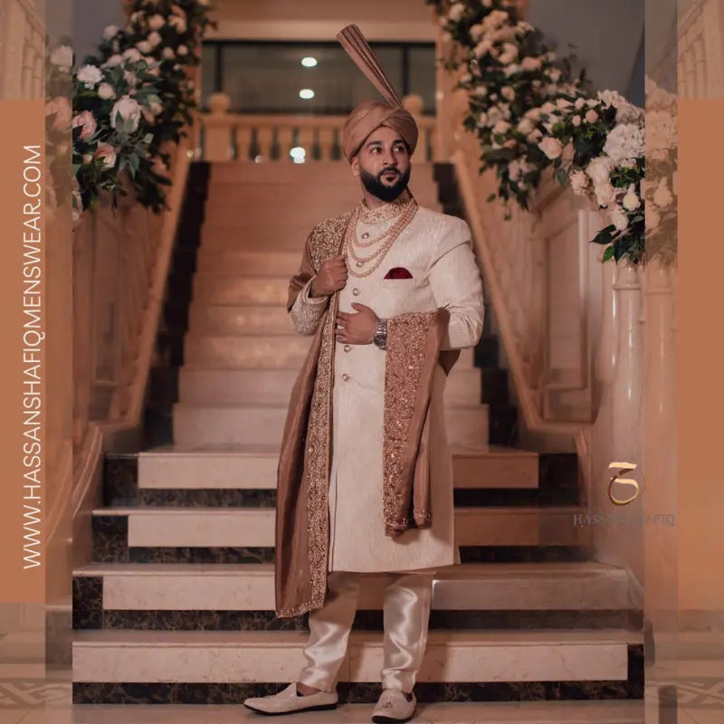
Understanding Traditional Wedding Dress Codes for Men

Traditional weddings have style rules that many grooms overlook. These rules quietly define what looks appropriate and what does not. This is where a Groom color palette guide becomes essential. Sherwanis, prince coats, and traditional outfits demand thoughtful color selection. Each dress code reflects status, culture, and formality.
Understanding these dress codes helps you avoid fashion mistakes. Traditional weddings usually lean toward elegant and regal colors. Bright or casual shades may feel out of place in formal settings. Color choice should respect tradition while showing personal style. The right balance makes the groom look refined and confident.
Formal Sherwanis vs. Semi-Formal Prince Coats – Choosing the Right Colors
Not all traditional outfits follow the same color rules. Formal sherwanis require deeper and richer shades. This Groom color palette guide helps distinguish formality levels clearly. Formal weddings demand colors that reflect royalty and tradition. Color selection defines the seriousness of the look.
Formal sherwanis work best in gold, ivory, maroon, navy, and deep green. These shades enhance heavy fabrics and detailed embroidery. Semi-formal prince coats offer more flexibility in color choice. Pastels, muted blues, soft greys, and champagne tones feel graceful here. Choosing the right color sets the tone of your entire wedding outfit.
Themed and Casual Weddings: Playing with Vibrant Colors in Traditional Clothes
Casual and themed weddings open doors to creativity. Grooms are no longer limited to classic shades only. This Groom color palette guide encourages tasteful experimentation. Bold colors can feel refreshing when styled correctly. Knowing how far to go is crucial.
Sage green, powder blue, dusty rose, and soft peach look stylish for relaxed events. Textured fabrics and subtle prints support bolder colors well. Embroidery should remain light to avoid visual overload. Accessories must stay neutral to balance the outfit. When done right, bold colors make the groom look modern yet traditional.
Seasonal Color Guide for Groom’s Attire
Season plays a key role in how a groom’s outfit looks and feels. The wrong color can appear dull or uncomfortable in certain weather. This Groom color palette guide helps you choose shades that suit the season. Seasonal colors improve comfort and overall appearance. They also enhance wedding photos naturally.
Choosing colors based on weather creates balance between style and practicality. Light seasons call for breathable fabrics and soft tones. Cooler seasons allow depth and richness in color. Seasonal planning prevents overdressing or underdressing. A season-appropriate palette always feels polished.
Spring and Summer – Light and Airy Color Palettes
Warm weather demands light and refreshing shades. Colors like ivory, beige, mint, and sky blue feel clean and elegant. These shades reflect heat and stay comfortable throughout the day. Soft embroidery looks refined on lighter fabrics. The overall look feels modern and effortless.
Light fabrics support these colors well. Linen blends, cotton silk, and light jamawar work best. The colors appear brighter under daylight. Minimal accessories maintain balance. The groom looks fresh and confident.
Fall and Winter – Deep Tones and Rich Textures
Cooler seasons suit bold and deeper colors. Maroon, emerald, navy, and charcoal create a strong presence. These shades pair well with heavy fabrics. Rich tones enhance texture and detail. The look feels luxurious and formal.
Velvet, raw silk, and thick jamawar enhance color depth. Gold or antique embroidery adds warmth. Dark colors photograph well in evening light. Accessories can be slightly heavier. This palette creates a royal groom look.
Choosing the Right Colors Based on Personal Factors

Your wedding outfit should feel like you. Not every trending color will suit every groom. This Groom color palette guide highlights the importance of personal fit. Skin tone, comfort, and confidence matter more than fashion hype. The right color makes you look natural and confident.
Understanding your personal features helps narrow down color choices. Colors should enhance your natural appearance. Comfort plays a big role in long wedding hours. Forced colors often look awkward in photos. A confident groom always looks stylish.
Matching Your Skin Tone with the Perfect Palette
Skin tone strongly affects how colors appear. Warm tones look best in ivory, gold, beige, and earthy shades. Cool skin tones suit navy, grey, emerald, and deep blue. Neutral tones allow more flexibility in color selection. Testing shades under proper lighting helps avoid mistakes.
Always check colors in daylight before finalizing. Indoor lighting can be misleading. Fabric texture also impacts color appearance. A shade that complements your skin looks balanced. This creates a refined groom look.
Personal Preference and Confidence in Color Choices
Personal comfort should guide your final decision. Choose colors you enjoy wearing. Confidence reflects in posture and facial expressions. Trends change, but comfort remains timeless. A relaxed groom always looks better.
It's evident when you feel good about your attire. Your movement feels natural. Your photos look effortless. Guests notice confidence instantly. The right color enhances your wedding presence.
Coordinating with the Bridal Party

Coordination creates visual harmony. Mismatched colors feel distracting. This Groom color palette guide promotes balance. Your outfit should complement the bride. Matching tones improve wedding aesthetics.
You do not need identical colors. Soft contrast works best. Dupatta, stole, or turban can match accents. Jewelry tones should align. This creates a polished look.
Fabric Choices and Their Influence on Color Selection
Fabric plays a major role in how colors appear on wedding outfits. The same shade can look very different on different materials. This Groom color palette guide explains the impact clearly. Fabric texture changes color depth and shine. Choosing the right fabric improves the final look.
Color and fabric should always be planned together. While some textiles absorb light, others reflect it. This affects how bold or soft a color appears. Wrong fabric choices can dull beautiful shades. Smart combinations create a polished groom look.
How Different Fabrics Affect the Appearance of Colors
Silk reflects light and makes colors appear brighter. Velvet adds richness and depth to darker shades. Cotton shows softer and muted tones. Jacquard highlights patterns and woven details. Fabric choice defines the overall visual effect.
Understanding fabric behavior helps avoid mismatched looks. Bright colors need controlled shine. Deep tones benefit from heavy textures. Texture enhances embroidery and detailing. Fabric selection shapes the final style.
Selecting the Right Material for Comfort and Style
Comfort matters just as much as appearance. Heavy fabrics suit winter weddings better. Lightweight materials feel right for summer events. Comfortable outfits support long wear. A relaxed groom always looks confident.
When comfort is right, style feels natural. Movement becomes easy. The outfit feels balanced. Confidence shows in posture. Comfort completes the look.
Accessories and Details That Complete the Color Palette
Accessories elevate the groom’s look. Small details matter greatly. This Groom color palette guide highlights finishing touches. Accessories should support the main outfit. Overuse can spoil balance.
Key Accessories to Consider
-
Turban or shawl color
-
Footwear tone
-
Buttons and embroidery accents
-
Jewelry and brooches
Choose accessories carefully. Keep colors within the same family. Let one element stand out. Harmony always looks elegant. Simplicity wins.
Customisation Options for a Personalized Groom Look
Every groom wants a look that feels truly his own. Ready-made outfits often lack character. This Groom color palette guide highlights the power of customization. Small design choices create a strong personal impact. Custom outfits always feel more special.
Personalization allows better control over style and comfort. Colors can be adjusted to suit skin tone and theme. Fit becomes sharper and more flattering. Details reflect personality. The final look feels intentional and premium.
Tailored Suits and Sherwanis as a Canvas for Color
Tailoring gives full control over color selection. The exact tint you desire is up to you. Fabric and fit enhance how color appears. Clean cuts improve overall elegance. The outfit looks refined and well balanced.
Custom tailoring also improves comfort. The outfit moves with ease. Proportions feel correct. Colors appear more structured. Tailoring elevates traditional groomwear.
Embroidery, Monograms, and Statement Details
Embroidery adds richness without overpowering the outfit. Monograms add a personal signature. Gold and antique tones remain timeless. Details should stay subtle and clean. Balance keeps the look elegant.
Thoughtful details enhance color depth. Overdone elements reduce charm. Small accents create focus points. Craftsmanship becomes visible. The groom’s look feels complete.
Popular Wedding Color Ideas for Grooms
Choosing proven colors reduces risk. These shades are timeless and elegant. This Groom color palette guide lists top options. Each works for traditional weddings. They suit different styles.
Popular Groomwear Options
These styles suit various themes. They photograph beautifully. They allow easy coordination. Trends may change, but classics remain. Smart grooms choose wisely.
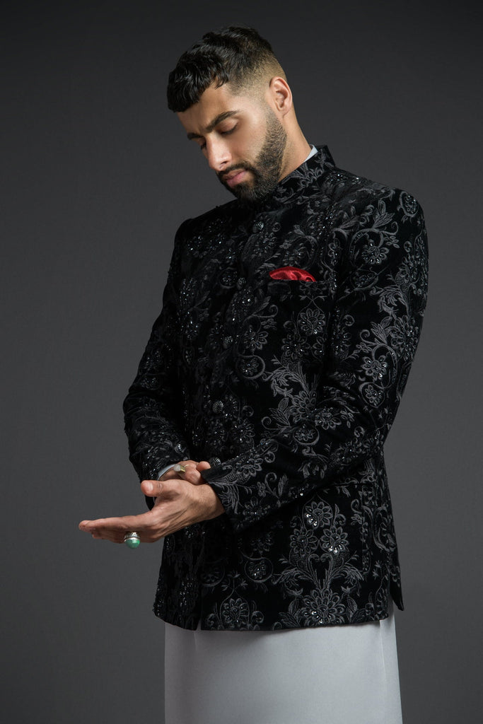
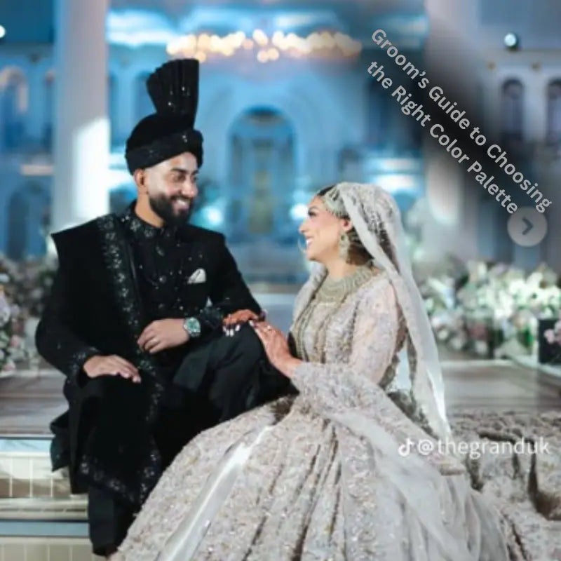
The Hottest Bold Color Palettes for Grooms in 2026
Bold colors are becoming a top choice for modern grooms. Statement looks are stylish without being overwhelming. This Groom color palette guide highlights trending shades for 2026. Bold does not have to be loud; it should feel balanced and elegant. With the right combination, these colors create a memorable and confident groom look.
Popular bold shades now include deep burgundy, emerald green, royal blue, and charcoal grey. Maroon paired with gold accents feels regal. Emerald with bronze embroidery looks fresh and unique. Navy with silver highlights is modern and versatile. These shades can be mixed with ivory or champagne for a balanced and sophisticated ensemble.
The Classic Tuxedo Moment – Reimagined in Bold Colors
Deep black with gold embroidery remains timeless. Rich navy with antique gold details adds a modern twist. Burgundy sherwanis paired with subtle bronze accents create a strong statement. Emerald green prince coats with ivory embroidery feel both fresh and royal. Minimal detailing and clean lines ensure bold colors stay elegant and stylish.
These color palettes work especially well for evening weddings. They look vibrant under lights and in photography. Fabrics like velvet, silk, or brocade enhance richness. Accessories can be used sparingly to maintain balance. Bold colors, when paired thoughtfully, make the groom stand out confidently..
3 Expert Tips to Perfect Your Groom’s Color Palette
Choosing colors feels easier with guidance. These tips simplify decisions. This Groom color palette guide focuses on clarity. Small rules prevent big mistakes. Smart planning wins.
-
Limit your palette to two or three colors
-
Use contrast wisely
-
Always test colors under lighting
These tips ensure harmony. They prevent over styling. Your outfit looks intentional. Confidence improves naturally. Photos look stunning.
Final Thoughts
Choosing the right colors defines your entire wedding style. Your outfit sends a subtle message about elegance, confidence, and personality. This Groom color palette guide makes planning simple and stress-free. Focus on harmony, comfort, and confidence to create a memorable look. When your outfit reflects you, every photo, step, and gesture feels natural. Don’t be afraid to mix bold and classic shades. Accessories, fabrics, and personal touches make your look truly one-of-a-kind.
Suit Up in Style for Your Next Wedding with Hassan Shafiq Menswear
Discover premium groomwear that blends tradition, trends, and personal style. Hassan Shafiq Menswear offers sherwanis, prince coats, and curated ensembles in perfect color palettes. Expert tailoring ensures flawless fit, while rich fabrics enhance every shade. Step into your wedding with confidence and elegance.
Explore the latest collections now and craft your dream groom look today!
FAQs
1. What colors are safest for a groom?
Ivory, navy, beige, and soft grey are timeless choices. They suit most skin tones and wedding themes. These colors photograph beautifully. They also pair easily with bridal outfits. Safe shades are perfect for a classic look.
2. Can grooms wear bold colors?
Yes, bold colors are stylish when balanced carefully. Deep burgundy, emerald green, and royal blue are popular choices. Pair them with neutral or metallic accents. Bold shades work best with themed or evening weddings. Balance keeps the look elegant, not overwhelming.
3. Should the groom match the bride’s outfit?
Not exactly. Complementing the bride’s colors is enough. Avoid copying her shades completely. Use accents, embroidery, or accessories to coordinate. This creates a harmonious and stylish wedding look.
4. How do I choose colors based on skin tone?
Warm skin tones look great in ivory, gold, maroon, and earthy shades. Cool skin tones suit navy, grey, emerald, and deep blue. Neutral skin tones have more flexibility. Always test shades in daylight. Fabrics and textures can change how the color appears.
5. Which colors are trending for 2026 weddings?
Bold and statement colors are gaining popularity. Emerald green, burgundy, royal blue, and charcoal grey are trending. Metallic accents like gold, bronze, and silver enhance them. Lighter shades like pastel blue and ivory are also in style. Mixing bold and soft shades creates a modern and elegant look.